By Drew Troutman
With Bellarmine University making the move to Division I in 2020, all eyes are on the athletic program. Students, faculty and fans are eager to see how the Knights will fair once they join the Atlantic Sun Conference. While most people are interested in seeing how Bellarmine stacks up against Division I talent, I have my eyes focused on something else: the logo on the players’ uniforms.
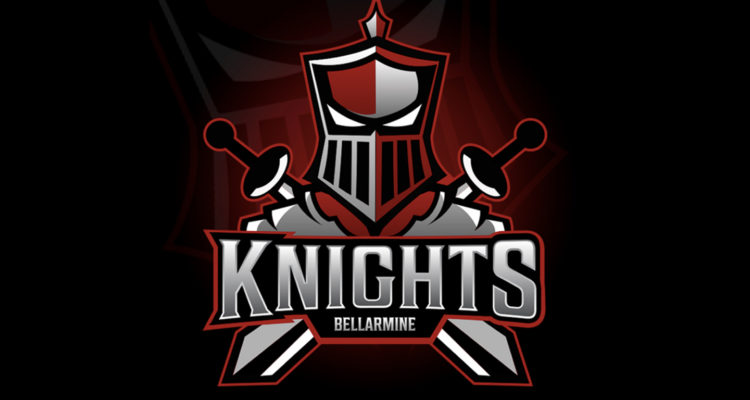
Bellarmine’s first president Alfred Horrigan established the knight as the school’s mascot when the school opened October 3, 1950. According to Bellarmine’s website, Horrigan was fascinated with King Arthur and the Holy Grail. The knight head logo used by the school was modeled after the helmet of the knight sculpture seen on Bellarmine’s campus.
There’s no question that the Bellarmine community has embraced the knight head logo. It showcases the school’s mascot and is featured at the top of the school’s beloved crest. However, with a major change coming to Bellarmine athletics, it could be time to change the Bellarmine logo.
I propose that Bellarmine changes its logo to a tough, fierce-looking knight. Bellarmine athletics have been dominant over the past decade, and with the school making the jump to Division I, I think it’s time for Bellarmine to make its presence known with a bold, new look.
Jeff Davidson is a designer and behavioral strategist who helps market brands. Davidson has worked for both premier startups and international clients, including the tech giant IBM. In a story for Medium published Jan. 18, 2019, Davidson discussed the elements of a great logo.
“To understand what a great logo is, we must first consider its purpose,” Davidson said. “A logo is essentially a tool for conditioning. [It’s] the unique form that communicates the ownership of a particular good or service.”
Writer Steven Slivka discussed the “intimidation factor” in a 2012 story for Bleacher Report. While a logo doesn’t affect a team’s level of play, Slivka said, “a little intimidation never hurt anybody.”
“While logos have changed and evolved over time, the ‘scare tactic’ has never gone away,” Slivka said. “Although not every team has a daunting, overpowering logo to scare off visitors, there are those that are just that much more intimidating than the rest.”
Bellarmine recently met with Adidas to discuss the school’s upcoming uniforms, which will feature the ASUN Conference logo. Bellarmine’s Director of Athletics Scott Wiegandt said updating uniforms is part of the athletic department’s budgeting process.
“A lot of our teams utilize the Adidas custom design,” Wiegandt said. “Taking the step to [Division I], I would like for us to have some of the same looks that some of the other Adidas institutions have.”
Wiegandt said he’s considering whether all the athletic uniforms should say ‘Bellarmine’ rather than ‘Knights’ to help raise awareness for the university.
“When we’re at home, everybody knows were Bellarmine, so we have ‘Knights’ on our home gear,” Wiegandt said. “But, when we’re on the road, we have ‘Bellarmine.’ Should we have ‘Bellarmine’ on both home and away?”
Wiegandt said he hopes to turn Bellarmine into a household name and believes branding is a major component of achieving this.
“I think we should throw Louisville, Kentucky, in there as part of the branding,” Wiegandt said. “I want everybody to know about Bellarmine – and I want them to know how to say it – and I want them to know it’s in Louisville. I think those are key components to our branding and our brand reach as we go forward.”
Davidson said designers should strive to create memorable logos. A fresh new logo has the potential to generate massive buzz for a school.
“Great logos are ambiguous, intriguing, and often remarkable,” Davidson said. “Remarkable designs, advertisements, and stories spread virally. People see or use something, they tell their friends, and then it spreads. [Logos] can be remarkable and interesting enough for people to want to talk about.”
Davidson said a well-designed, structurally sound logo can do wonders for a brand’s success.
“Humans are attracted to language and symbols that adhere to organization, alignment, and symmetry,” Davidson said. “Structural soundness equates to deliberateness, which equates to excellence. Most companies should strive to communicate excellence.”
With Bellarmine being an excellent school, it needs an excellent logo to represent it. And, with the school’s athletic teams looking to do damage in Division I, it could be time to adopt a sharper, more aggressive look.